tl; dr
geom_histogram(aes(fill = stat(x))) すればいい。
ヒストグラムをヒートマップの凡例 + αにしたい
から、ヒストグラムのビンの色をx軸に応じて変えたいと思った。
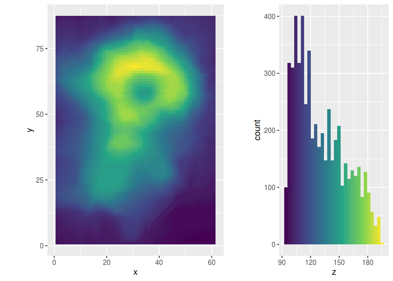
具体的には下みたいなの。

使ったデータセットは volcano です (Maunga Whau Volcano)。
試行錯誤の歴史
データ整形
volcano は matrix なので、座標付きのデータフレームに整形する。
expand.grid に与える引数の順序と (y, x)、
y が降順で x が昇順なところがポイント。
volcano_df <- data.frame(
  z = c(volcano),
  expand.grid(
    y = seq(nrow(volcano), 1),
    x = seq(ncol(volcano))
  )
)
ヒストグラム
fill = x ではダメ
library(ggplot2)
gghist0 <- ggplot(volcano_df, aes(z)) +
  geom_histogram(aes(fill = x)) +
  scale_fill_viridis_c()
gghist0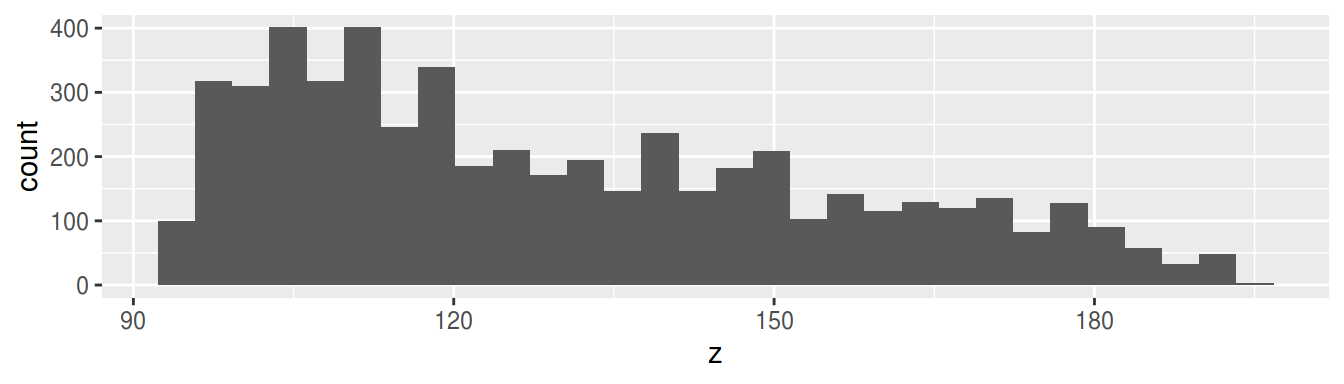
geom_histogram において、
fill はグループごとの色分けに使うものだがら、というのが雑な理解。
連続値を与えると無視されてしまう仕様っぽいけど、ソースのどこらへんかまでは追えていない。
アヤメの種類のような離散値ならOK (下図)。
ggplot(iris, aes(Sepal.Length)) +
  geom_histogram(aes(fill = Species))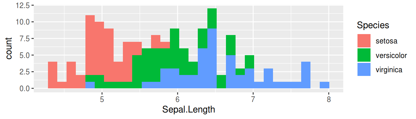
fill = stat(x) ならOK
gghist <- ggplot(volcano_df, aes(z)) +
  geom_histogram(aes(fill = stat(x))) +
  scale_fill_viridis_c()
gghist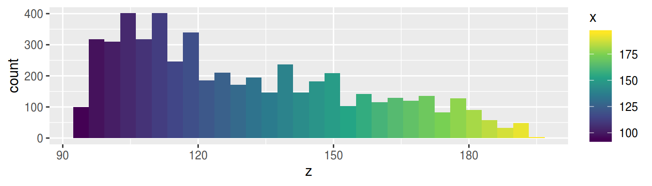
stat を使うと、ヒストグラムを描写するための計算結果に応じた審美的属性に用いる変数の選択ができる。
主に何が使えるかは、ヘルプの “Computed variables” の項に載っている。
geom_histogram の場合は
| Computed variables | 説明 |
|---|---|
| density | 密度 (頻度 / サンプルサイズ) |
| count | 計数 |
| scaled | density の最大値を1に変換したもの |
| ndensity | scaled に同じ。 |
実際には x など、ggplot_build した時に出てくるデータフレームの変数ならなんでもよさそう。
str(ggplot_build(gghist)$data[[1]])## 'data.frame': 30 obs. of 17 variables:
## $ fill : chr "#440154" "#45125C" "#461E65" "#46296E" ...
## $ y : num 100 318 310 401 318 401 246 340 186 211 ...
## $ count : num 100 318 310 401 318 401 246 340 186 211 ...
## $ x : num 94 97.5 101 104.5 108 ...
## $ xmin : num 92.3 95.8 99.3 102.7 106.2 ...
## $ xmax : num 95.8 99.3 102.7 106.2 109.7 ...
## $ density : num 0.00541 0.0172 0.01677 0.0217 0.0172 ...
## $ ncount : num 0.249 0.793 0.773 1 0.793 ...
## $ ndensity: num 0.249 0.793 0.773 1 0.793 ...
## $ PANEL : Factor w/ 1 level "1": 1 1 1 1 1 1 1 1 1 1 ...
## $ group : int -1 -1 -1 -1 -1 -1 -1 -1 -1 -1 ...
## $ ymin : num 0 0 0 0 0 0 0 0 0 0 ...
## $ ymax : num 100 318 310 401 318 401 246 340 186 211 ...
## $ colour : logi NA NA NA NA NA NA ...
## $ size : num 0.5 0.5 0.5 0.5 0.5 0.5 0.5 0.5 0.5 0.5 ...
## $ linetype: num 1 1 1 1 1 1 1 1 1 1 ...
## $ alpha : logi NA NA NA NA NA NA ...ソース
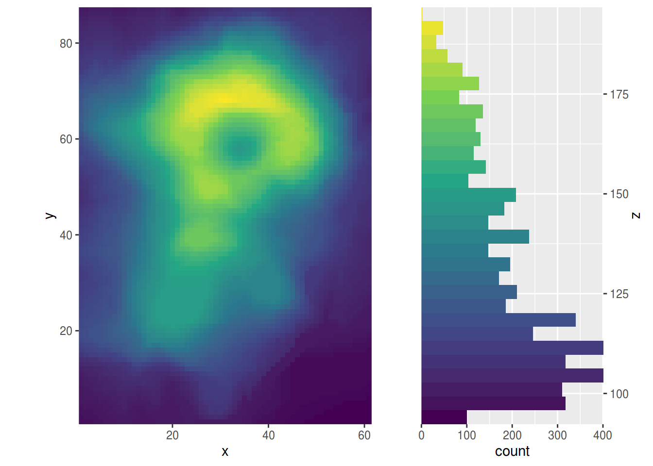
以下は冒頭に出した図を描写するためのソースコード。
library(pacman)
p_load_gh("thomasp85/patchwork")
p_load(ggplot2, tibble)
volcano_df <- data.frame(
z = c(volcano),
expand.grid(
y = seq(nrow(volcano), 1),
x = seq(ncol(volcano))
)
)ggheat <- ggplot(volcano_df, aes(x, y, fill = z)) +
geom_raster() +
scale_fill_viridis_c() +
coord_fixed()
ggheat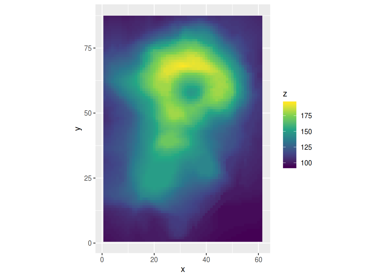
gghist <- ggplot(volcano_df, aes(z)) +
  geom_histogram(aes(fill = stat(x))) +
  scale_fill_viridis_c()
gghist
wrap_plots(
  ggheat + guides(fill = "none"),
  gghist + guides(fill = "none"),
  widths = c(1, .5)
)
追記
軸の入れ替えや、場所替えをすると、よりそれっぽく、かっこよくなるかも?
周辺分布と紛らわしいかな?
wrap_plots(
  ggheat + coord_fixed(expand = FALSE),
  gghist +
    scale_x_continuous(name = "z", position="top") +
    coord_flip(expand = FALSE),
  widths = c(1, .5)
) *
  theme(legend.position = "none")